Furcy Botanik Website Redesign
Modernizing a botanical skincare brand with data-driven UX, bold visuals, and a simplified e-commerce journey.
Year
2024
Timeline
8 weeks + 3-week extension
Role
UX Designer
Team
Collaborative UX/UI Design
Tools
Figma, Google Analytics, Photoshop, Shopify
01. The Challenge
Lack of Differentiation & Performance Gaps.
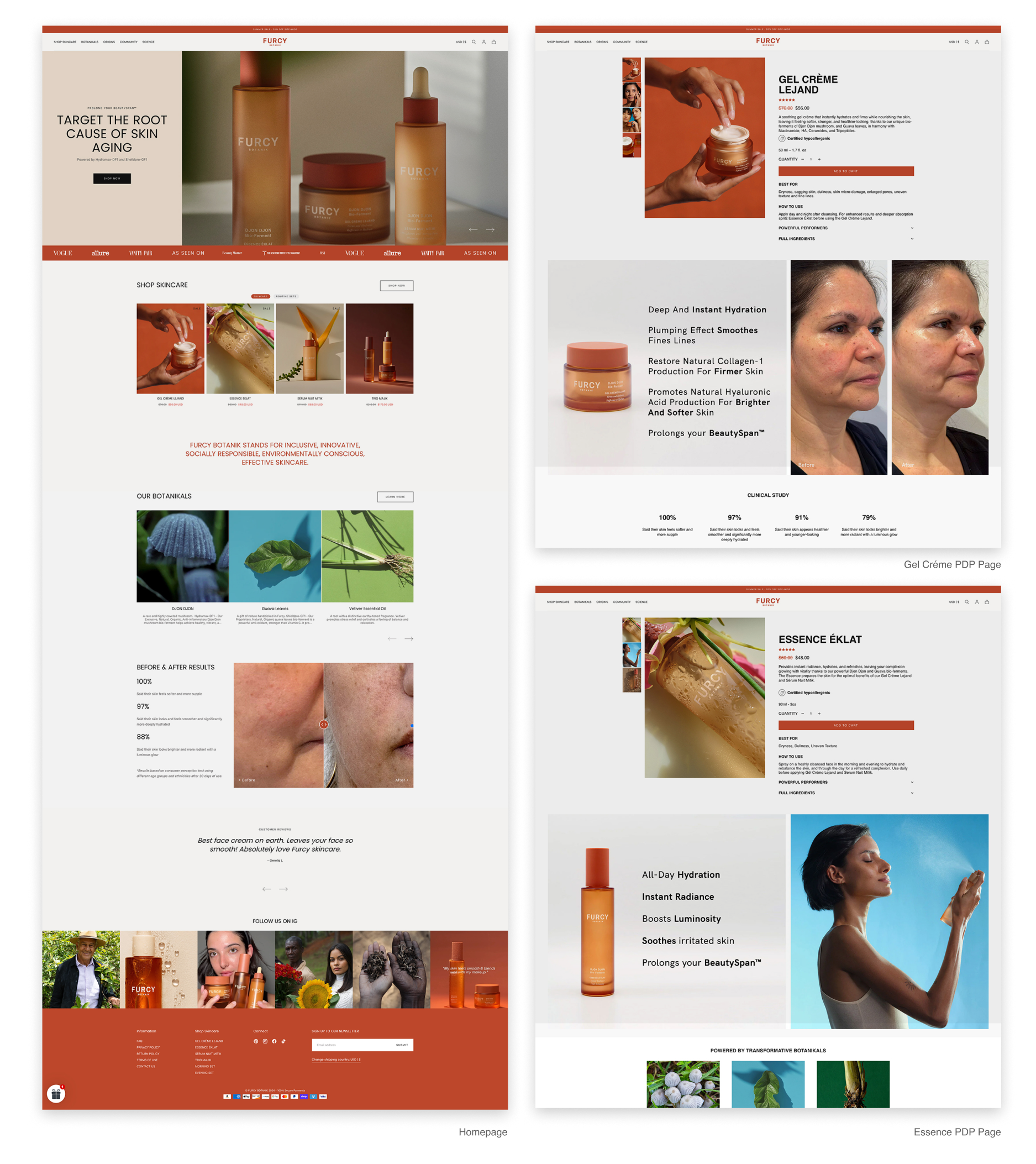
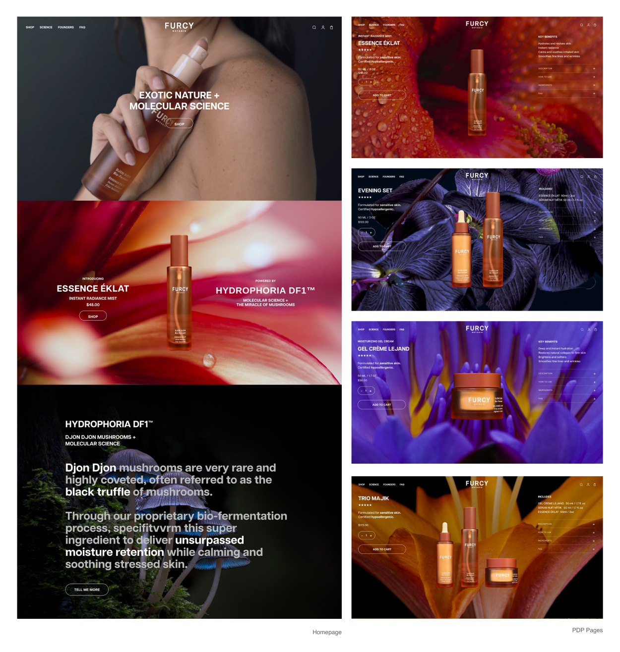
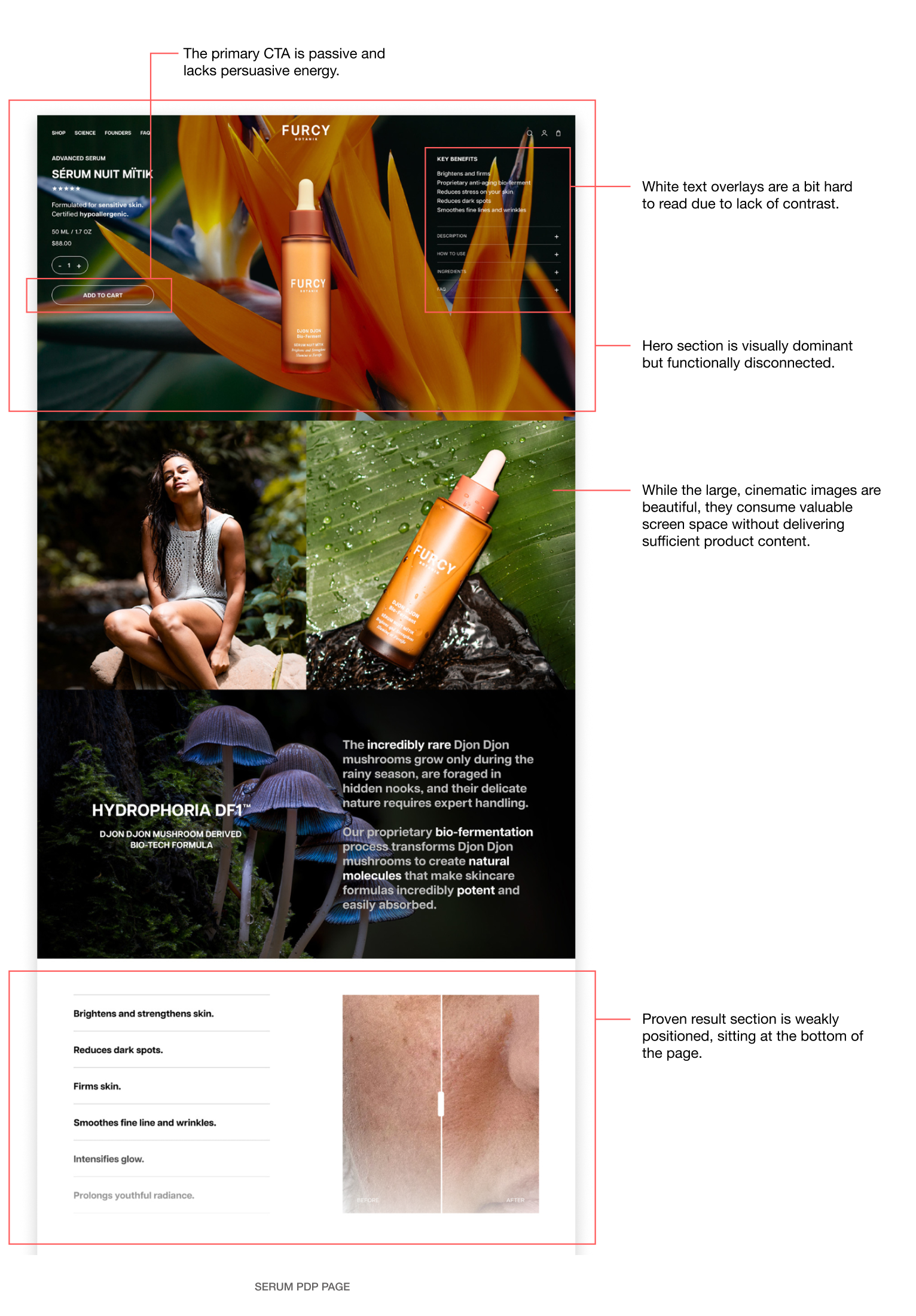
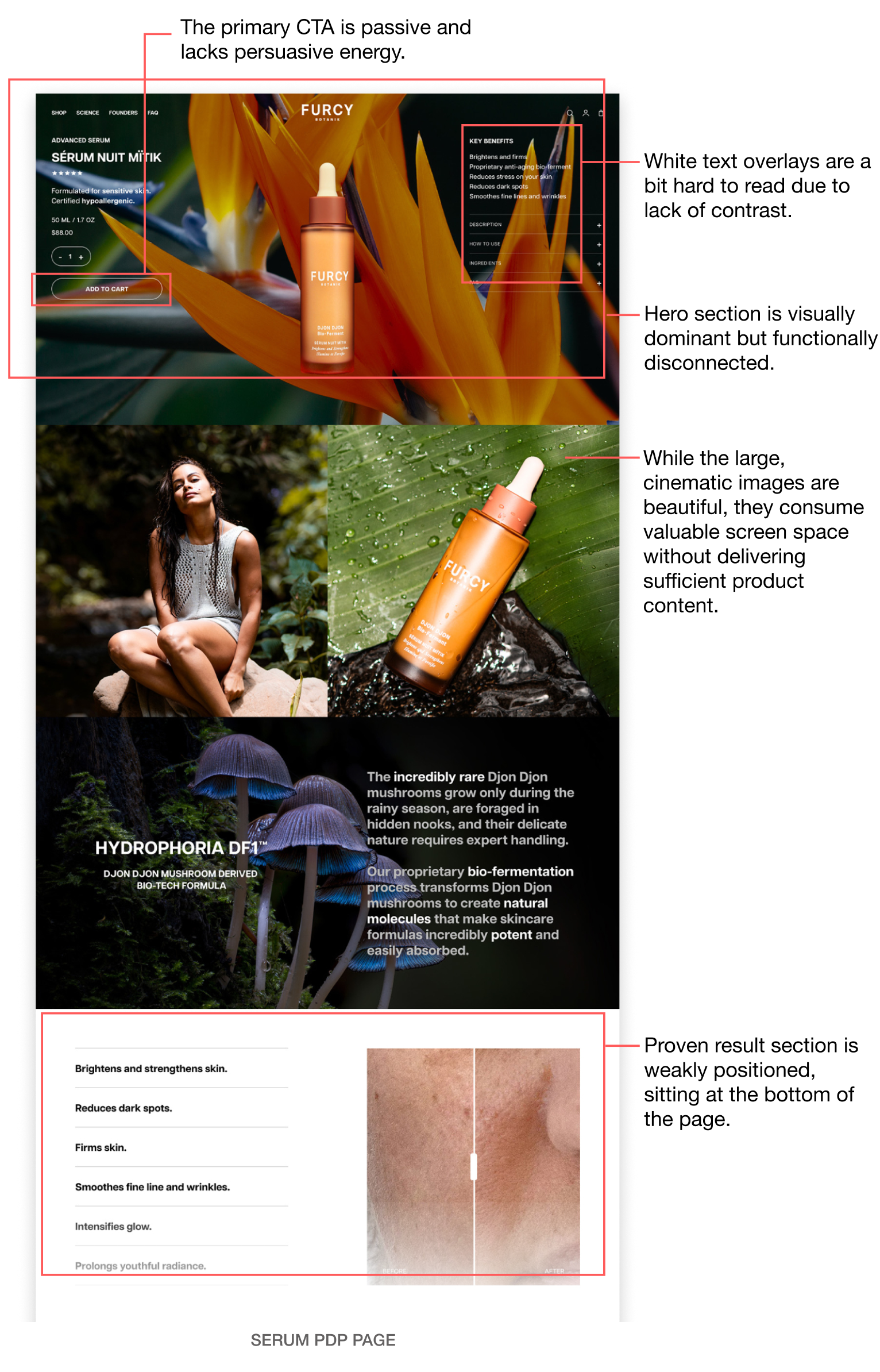
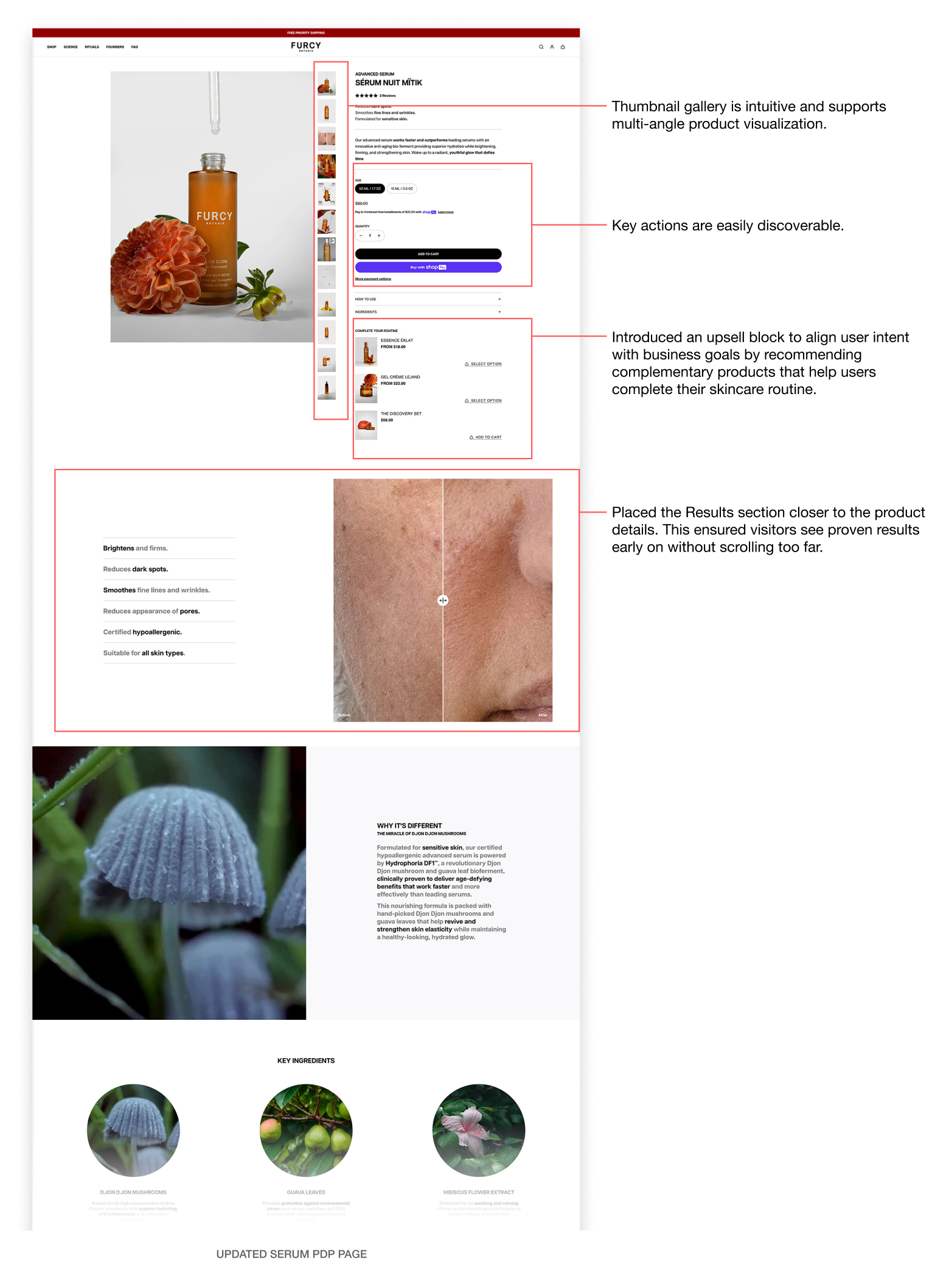
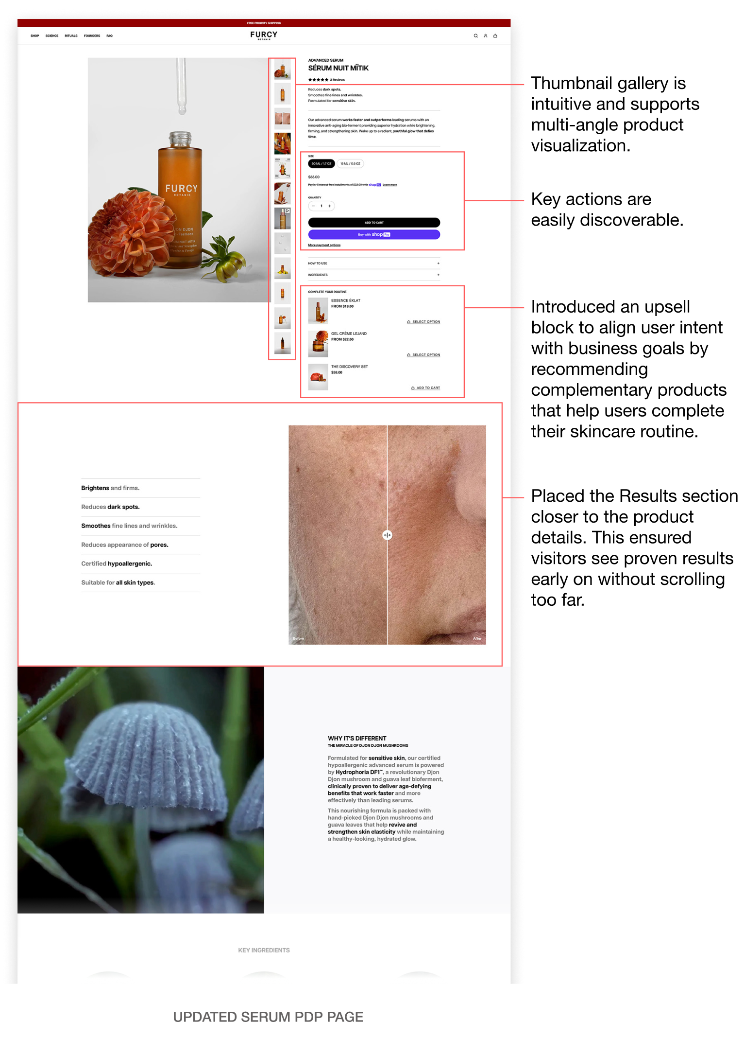
Furcy Botanik had a strong product line based on rare, clean ingredients, but their website underperformed in terms of user engagement and conversions. The existing site lacked a coherent user experience, leading to high bounce rates.
Our goal was to design a distinctive, engaging experience that would:
  • Differentiate the brand from conventional skincare websites
  • Highlight the unique natural ingredients
  • Create a seamless and intuitive user journey, especially on product pages
  • Ensure marketing materials were compatible with the new site design
02. Initial Design Direction
A bold, unconventional visual style.
In the first round, the design approach was heavily focused on standing out visually:
Creative Direction: Use vibrant, exotic nature imagery and close-ups of flowers to tell the story of rare botanical ingredients.

PDP Design: Included several content sections (ingredient explanations, before/after images, testimonials), which were meant to make the product pages informative and engaging.
BEFORE
AFTER
03. What We Learned
What Didn’t Work:
After launch, analytics showed a few problems. Visitors spent less than 8 seconds on the product pages and didn’t scroll much, which suggested the pages were too busy or hard to follow.
Also, marketing assets taken from these pages didn’t work well—transparent product images clashed with the colorful backgrounds, often resulting in blank or gray visuals in ads.
Key Learnings:
  • Users Needed Simplicity: The complex layout and dense content in the PDPs weren’t resonating with visitors.

  • Marketing Compatibility: The visually complex designs didn’t translate well for ads or other marketing channels.
  • Usability: Users leaned towards more familiar, straightforward e-commerce layouts. The overly artistic approach was causing friction with their expectations for an easy, efficient shopping experience.
04. What We Changed
From Bold to Purposeful: Reworking the Experience for Usability and Conversion
In response to these insights, the second round of the redesign was focused on simplicity, usability, and aligning with user expectations.

Repurposed original visuals for Instagram to retain brand voice on social.